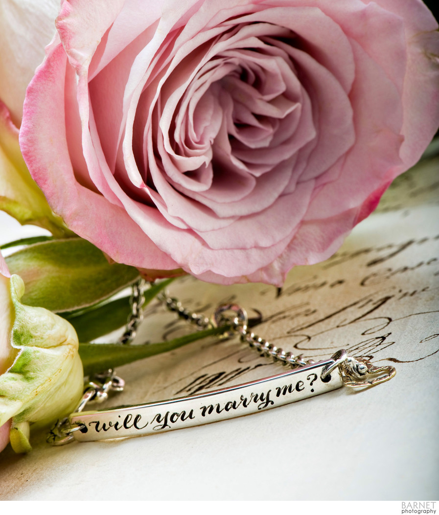
Product photography taken in our Costa Mesa, CA studio of lovely jewelry. This bracelet image was for a full page ad in a bridal magazine. Because the photo in the ad was going to show the item much larger than in real life, as is the case with most jewelry ads, the piece had to be "cleaned up". The casting of these items is usually not flawless, and the inscription not perfect, so flaws are always corrected in post, though in real life one would not notice these flaws. Because the ad was for a bridal magazine, the props that complement the product are flowers and parchment with calligraphy. Also, because it's an ad, the product is not seen in its entirety, as it would in a catalogue photo. Ads for jewelry and similar luxury items are designed to suggest a lifestyle, a feeling, and so on. They are meant for the reader to want to know more and visit the company's website. There was no art direction for this image--after having a conversation with the manufacturer we at Barnet Photography employed our own ideas to style the session. The result was an ad that was very successful!
Location: Costa Mesa, CA.